Brainard's Cover Art
Aesthetic Vocabulary
To understand the style of Joe Brainard’s covers, it is necessary to develop an aesthetic vocabulary that can describe the graphic elements that Brainard consistently uses throughout his cover work. This will help to establish the unique style of Brainard’s cover designs so that it can be differentiated from his artwork. The following descriptions will use specific pieces of his work to illustrate the continuous aspects that stand out throughout all of the covers he produces.

Vector Art
Many of Brainard’s covers show off his vector art style, which consists of single colors, use of lines and use of contrast to create depth. This style of his can be seen almost on all of his mimeographed covers. Because mimeographs could only use one color, he had to design his covers to this limitation. His ingenuity to adapt to this is so clever because the way he uses negative space allows for elements to either pop off the page or develop form. Looking at The Cigarette Book, the puffs of smoke jump off the cover and develop the cloud-like shape because of the negative space between the black line and the background .This contrast tricks the viewer’s eye into seeing depth on a two-dimensional, single color cover. Brainard also uses this technique for the cover of ZZZZ Z Press Magazine where he utilizes the negative space on a trash bag pile to define the man sinking into it. Looking at the pants specifically, the curvy lines that form the legs make the man appear engulfed in the surrounding bags because it makes his legs look unnatural until it is understood that his legs are covered with the bags. Brainard’s cleverness with his use of contrast turns a rudimentary mimeographed print into art full of depth.
Collaged Compostion
Brainard’s collages are some of the most famous works he’s ever produced. So it is no surprise that he uses a collaged composition style within many of his covers. This style consists of Brainard combining different elements together to create the cover. The World Magazine No. 9 illustrates how he compiles multiple patterns together to create a fluid piece of work. The centerpiece of this cover is the woman and child in the center and they are shielded by an arch filled with patterns. Because of how he mixes different patterns to make them all juxtaposed one another, he develops depth and movement on the cover. This collaging style allows him to keep the cover unified together visually because of how the patterns blend together to create texture on the page. When compiling multiple images together, he uses a similar approach to make a cohesive cover. On the cover of Highjacking, it has many different silhouettes of objects scattered throughout the entire cover page. However, some silhouettes have more gravity because of their direct relation to the title such as the gun and keys. Other silhouettes have no correlation to the title at all, such as the nails, fish hook and branch, which make them not as important. Because of this range, Brainard establishes a hierarchy allowing him to contrast the interesting and thought provoking elements with the uninteresting elements to make the impact of the important element stronger. Brainard incorporates his collaging expertise within his cover work, which allows him to compose in a unified way.


Casual Fonts
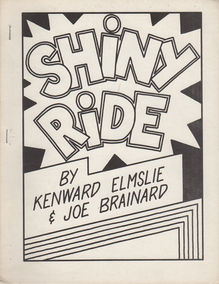
Brainard’s type on most of his covers is done by hand revealed by the small imperfections and inconsistency in his lettering. But this casual quality of his fonts is what makes his cover style so unique for it gives his text personality. For example, the font of the cover of Bean Spasms is not precise for there is different sizes and thicknesses for the same letters. However, this aesthetic is inviting to the reader for it’s not a perfect pompous serif font, which is intimidating, but instead its imperfections are what make this text relaxed and welcoming. By using this unprofessional text, Joe Brainard continues to push against the “elite aura” by trying to change the traditional style of fonts. Brainard also made text the art of the cover by composing text in new ways. The cover for Power Plant Poems is a prime of example of this for Brainard puts the word “POWER PLANT” in an arc and “POEMS” in a downward slant. Although this cover is very simplistic, it’s fun to read because the arc and slant make the reader’s eye go through a “reading playground”. And this “reading playground” is seen throughout many of his covers where he will employ movement to the position of his words through zig-zags, arcs and slants. Joe Brainard is reforming the purpose of text and making it an experience rather than a forgettable graphic element.


